PORTFOLIO
TOTAL POLITICS
A competition-winning magazine cover created for Total Politics’ Women in Westminster edition. I explored the theme through abstract illustration, using the brand’s existing colour palette to create a bold and contemporary visual identity. The aim was to create something eye-catching and editorial while celebrating the women at the heart of the publication.

JOJO
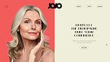
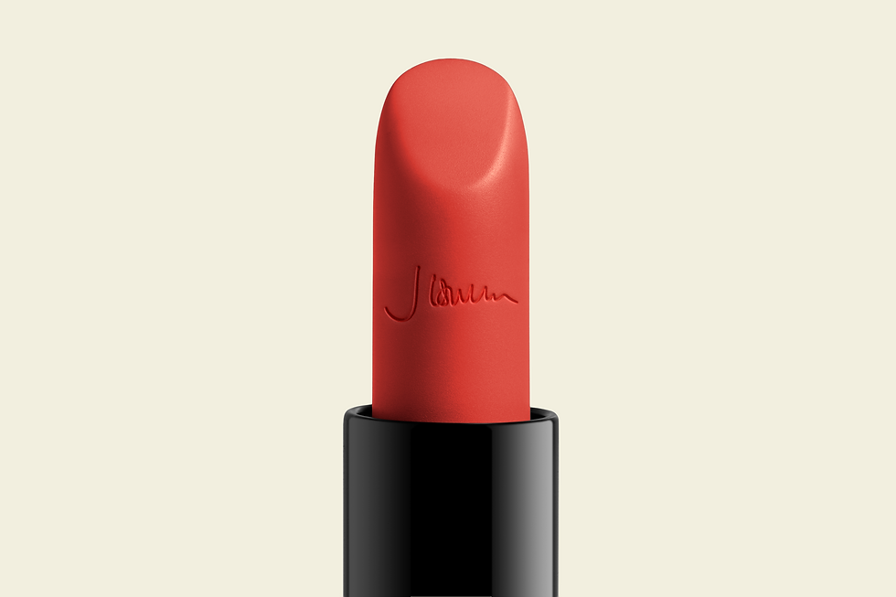
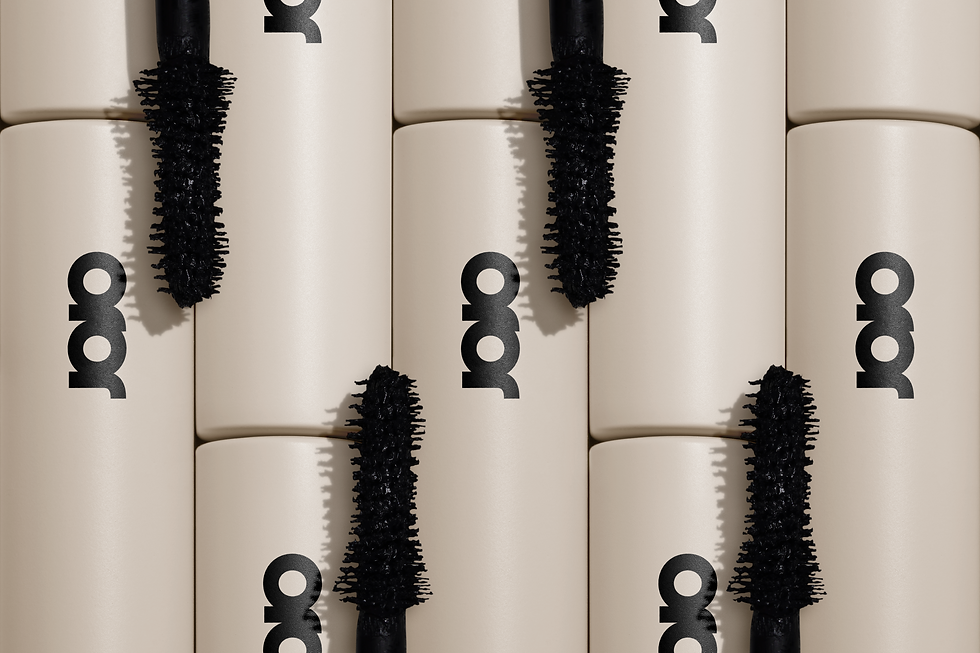
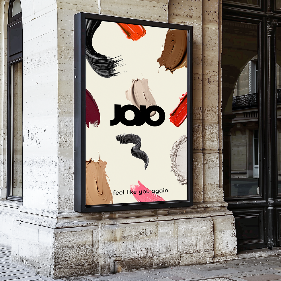
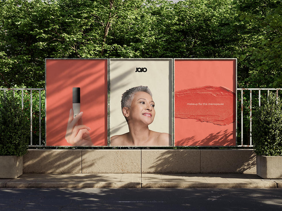
A branding project for JOJO, a makeup brand created to support women through the menopause and help rebuild confidence during a period of significant change. The identity uses bold, uplifting visuals and a confident colour palette to challenge the often-negative conversation around menopause and celebrate feeling good in your own skin.


KEITHS ADVICE
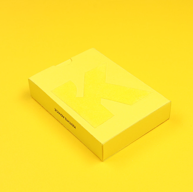
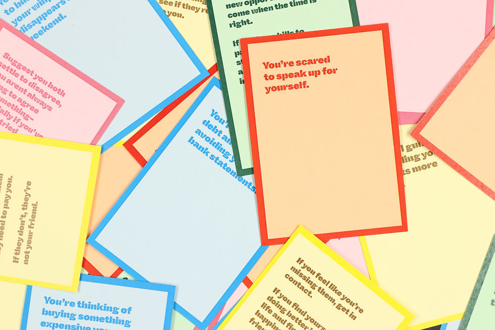
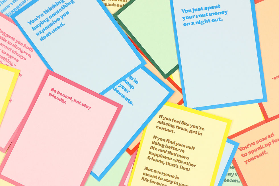
A playful packaging experiment inspired by an unexpected interaction with a stranger who offered some surprisingly good advice. I developed a box of cards featuring everyday situations on one side and words of advice on the other, turning a small, memorable moment into a tangible and interactive experience. The project explores how packaging can be used to tell a story, spark curiosity and create a sense of connection.
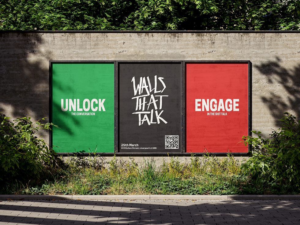
WALLS THAT TALK
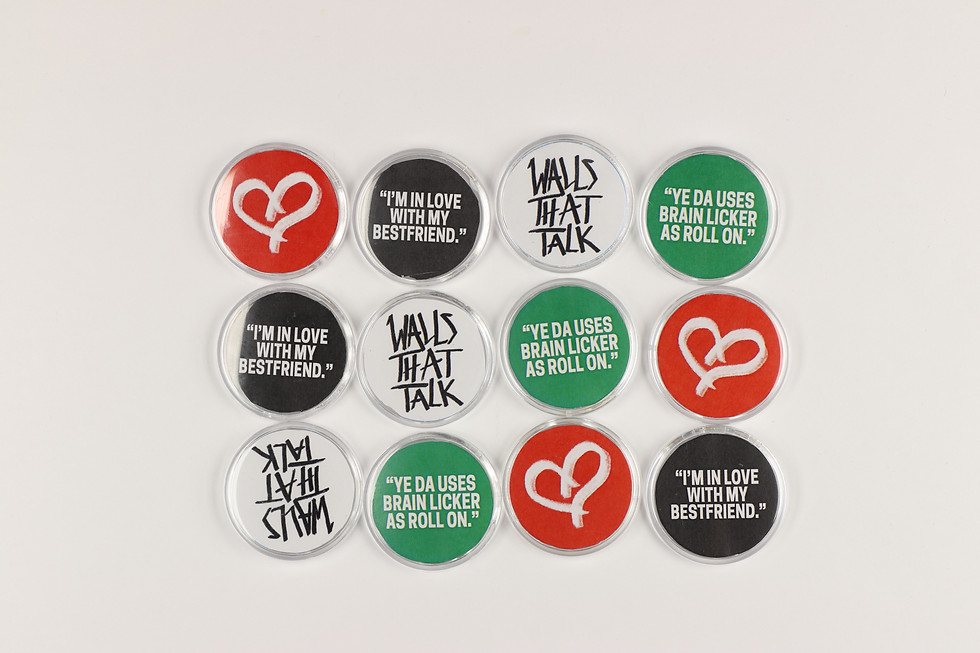
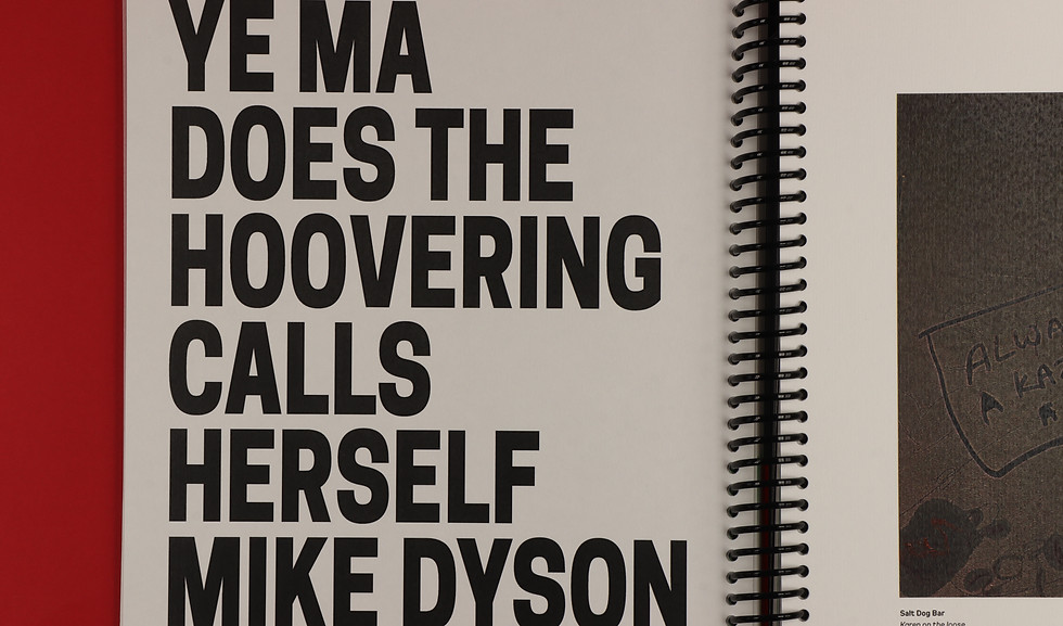
A collaborative project exploring the language, typography and culture of graffiti within Liverpool’s clubbing scene. We explored the deeper meanings behind the words and phrases found across the city, as well as the differences in language and experiences between men and women. The project brought our research together through a series of designed outcomes, including a photographic publication, illustrated dictionary and merchandise, creating a cohesive visual language around Liverpool’s nightlife culture.
@https://grace-richards.co.uk/
@https://lilliemaakestaddesign.cargo.site/
https://lucyannedesign.cargo.site/



KEITHS WAY
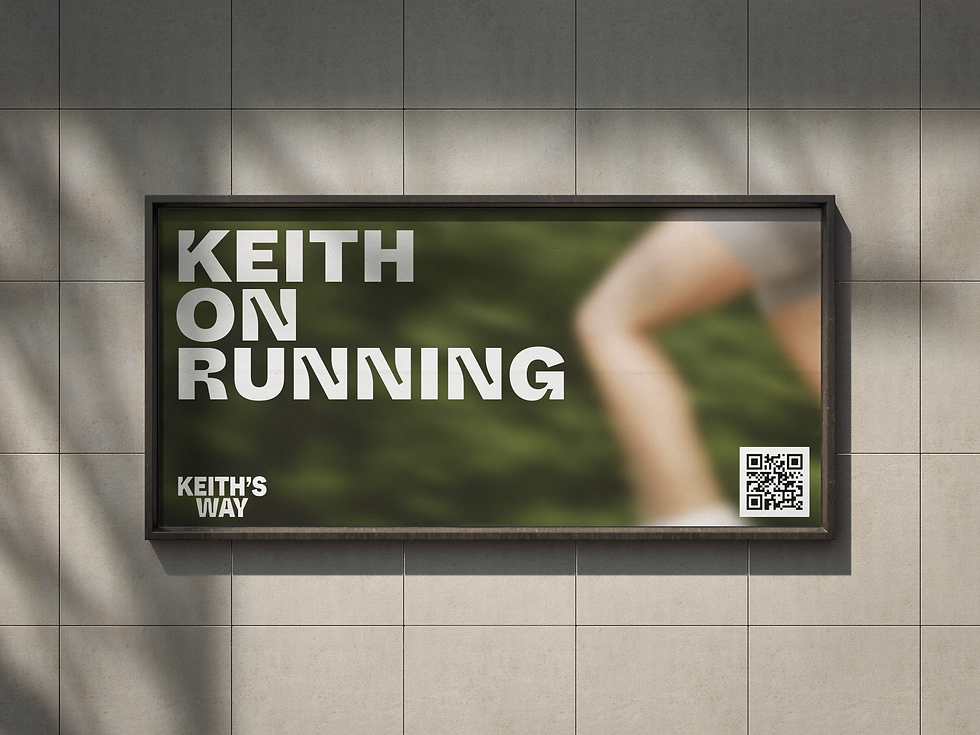
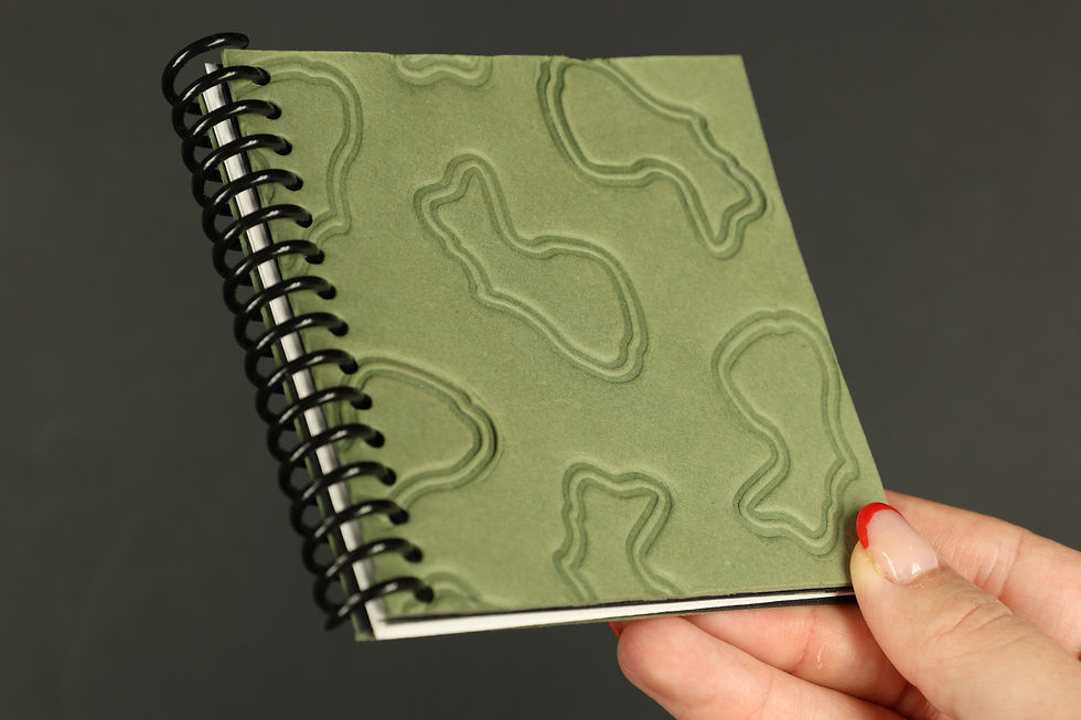
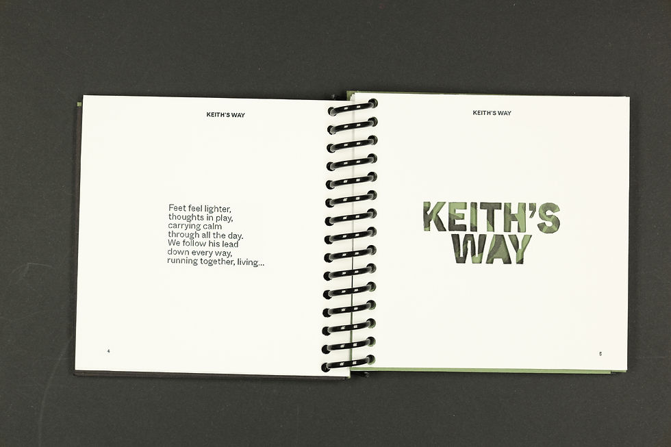
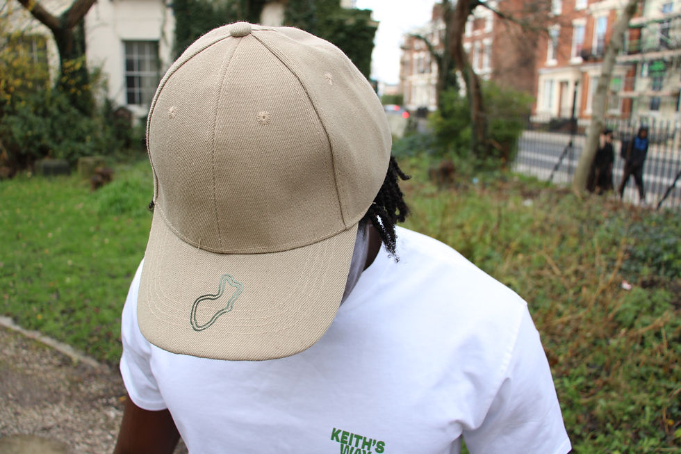
A branding project developed as a follow-on from KEITHS ADVICE, exploring the story behind the stranger who inspired the original project. Keith was a runner, and we first met while out on a run, which became the starting point for creating a fictional run club inspired by our chance encounter. Earthy tones reference the place where we met, while a satellite loop of the original running route became a key graphic element within the identity. These personal details were developed into a cohesive visual language across the run club’s branding, merchandise and publication, giving the identity a deeper connection to its story and place.